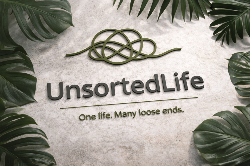
For the past few days, I’ve been working on the logo and the entire brand idea behind UnsortedLife, and below I’m presenting the new logo.
Just like life itself, unsorted and full of curves, paths, and different directions, that’s how I wanted the logo to feel. Unstructured in the right way. Natural. Exactly what it is. Most importantly, I like it, and that’s what allows me to build a story and a brand around it.
Much like my own life, which has been and still is a complete mess that has taken me everywhere and nowhere at the same time, the logo doesn’t just represent the site and its name. It represents me in the end. My movement, my thoughts, and the way I see things.
The colors in the logo aren’t there to symbolize anything deep or profound. They’re simply there because I like them. I could easily start explaining what the logo isn’t, but that’s not the point. The point is what it is. And what it is, first and foremost, is something that needs to satisfy me before anything else.
The same applies to the website itself. This is my space. Whether you like it or not doesn’t really matter. What matters is that it makes sense to me, that it represents me, and that I know what I want to do with it moving forward.
Anyway, below is the site’s logo. I hope you like it, because to me, it’s perfect.
That’s it for today. Nothing big, nothing special. Short and clear.
BOOM. Here’s the site logo.